We recently updated our Measuring Justice Dashboard with a new metric on court non-appearance. As with all Dashboard metrics, you can explore the data at the state and county level. Here’s a quick summary of what you’ll see on the Dashboard’s new metric. But if you want to get right to it, click here to access the Dashboard directly.
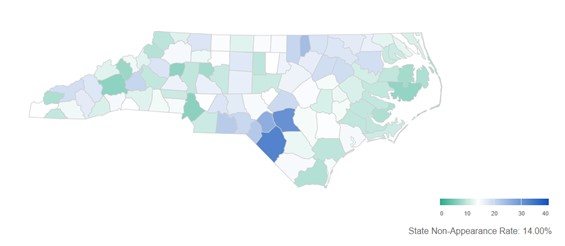
The Court Non-Appearance Map Tab lets you compare state and county-level non-appearance rates. Counties with non-appearance rates above the statewide rate appear in a blue gradient scale; counties below the statewide rate appear in a green gradient scale. As you hover your mouse over each county, you’ll see county names and local non-appearance rates. The legend shows the statewide non-appearance rate for cases initiated in the years you select, from 2019 through 2021. As shown below, at the state level for cases initiated in 2019 through 2021 the non-appearance rate is 14%. On the flip side, that means that people appear as required in 86% of cases.

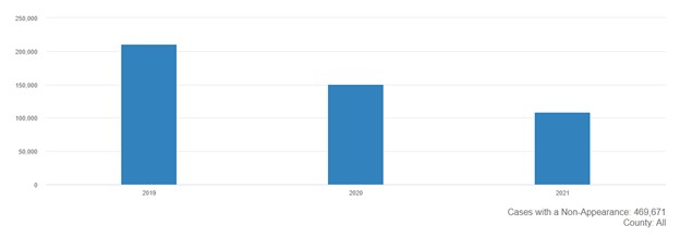
The Count Tab shows the number of court non-appearances by year of case initiation. This tool lets you explore trends in the volume of non-appearances over time. In the graphic below, we see the volume of non-appearances declining over time. This is to be expected – newer cases have fewer opportunities for individuals to miss a court appearance than older cases.
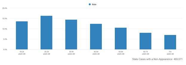
On the Age Tab you can see which age groups have the highest non-appearance rates. This can be helpful to know if you’re thinking about ways to promote court appearance. The figure below shows that younger people have the highest non-appearance rates. This may suggest, among other things, that outreach through technological tools may be more effective than a snail mail postcard.
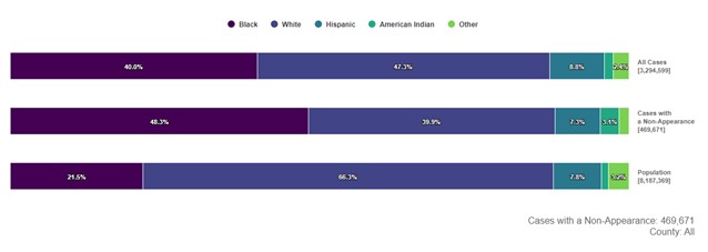
On the Race Tab, there is more demographic information about court non-appearances. The figure below shows state data for cases initiated in 2019 through 2021. As shown there, Black individuals made up 21.5% of the adult population. At the same time, 40% of the initiated cases were charged against Black individuals and 48.3% of the cases with a non-appearance involved that same group. It’s hard to know why these differences are occurring, but awareness of these data points can help local communities think about ways to promote court appearances.
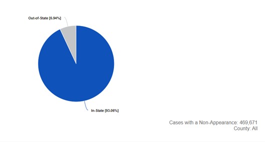
The Location tab shows the percentage and number of court non-appearances based on where the charged individual lives. This tool gives you a lens for examining how residence relates to non-appearance. At the state level, you can see in-state and out-of-state data; at the county level you can see in-county, out-of-county, and out-of-state data.
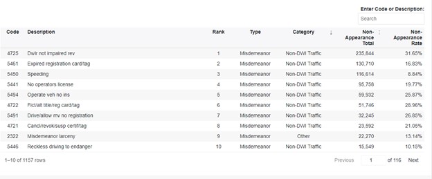
The Rank Tab really lets you dig into the data. It shows the total number of court non-appearances and non-appearance rates by offense. Because you can look at the data at the county level, this tool can help you focus your efforts to promote court appearances. The figure below shows the offenses that racked up the most non-appearances statewide, for cases initiated in 2019 through 2021. As seen below, non-impaired driving traffic offenses account for the vast majority of non-appearances, and they make up nine of the top ten non-appearance offenses.
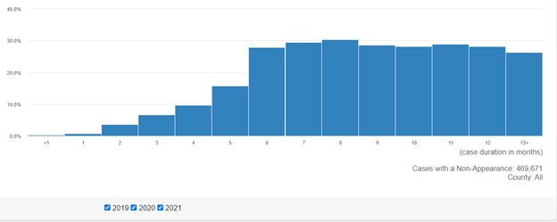
Finally, the Duration Tab shows the percent of court non-appearances by case duration. It helps you understand non-appearance rates in relation to case disposition times. One thing we see consistently in this Tab, at both the state and county levels, is that non-appearances jump once case duration hits six months. Thus, if you’re thinking of ways to reduce non-appearances, quicker case resolution is one answer.
I’ve written this blog post, but the real credit for the Dashboard belongs to the Lab’s post-doctoral fellow Andre Assumpcao and Lab project manager Ethan Rex—both of them are amazing at managing and analyzing data.
Have feedback about the Dashboard? Let us know.
