As blog readers know, the UNC School of Government Criminal Justice Innovation Lab has been developing a Measuring Justice Dashboard. Last year we released our Dashboard first metrics: Citation v. Arrest and Summons v. Warrant. We recently released a new Dashboard metric: Criminal Charging. In this post I’ll give some highlights of that tool. But in case you want to get right to it, you can access the Dashboard from the Lab’s web page (https://cjil.sog.unc.edu/); from the main page, click on “Measuring Justice.”
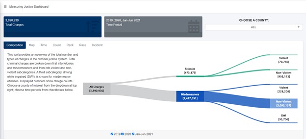
The first tab on the new Criminal Charging metric lets you see, at a glance, the composition of criminal charging in North Carolina. For this and all tabs, you can look at statewide data or use the dropdown at top right to select a specific county. You also can pick a relevant time period. Here’s that data visualization at the state level, showing charges from January 2019 through June 2021. One takeaway from this visualization is this: The great bulk of the charges in the system are non-violent misdemeanors.
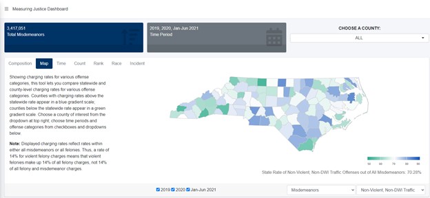
The Map tab lets you look at charging rates across the state, and tailor results by time period and offense category. In the figure below, you’re seeing charging rates for non-DWI traffic misdemeanors for all of North Carolina across all Dashboard time periods. As shown in the gray text at bottom right, non-DWI traffic misdemeanors make up over 70% of all charged misdemeanor offenses. Counties with a higher charging rate for these offenses are shown in gradients of blue; counties with lower rates are in gradients of green. One take away from this visualization: Not only is the system largely a non-violent misdemeanor system, but also the bulk of those misdemeanors are non-DWI traffic offenses.
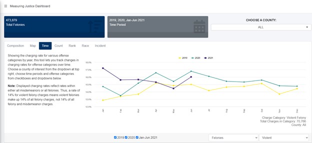
The Time tab lets you look at charging rates over time. In the visualization below we see, for example, charging rates for violent felonies statewide over a 2½ year period. As shown there, you can see that while violent felonies make up only a small portion of all felony charges, charging rates for violent felonies were higher in 2020 (green line) than in 2019 (yellow line). You also can see some moderation of those rates in the Spring of 2021 (purple line).
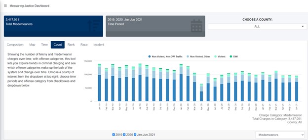
The Count tab moves away from charging rates and provides you with raw numbers of charges. Shown below is the data visualization for misdemeanors, statewide and for all Dashboard periods. As you can see there, North Carolina has experienced a downward trend in the number of misdemeanor charges. This figure also gives you another view for seeing the breakdown of misdemeanor charges, between non-violent, violent and DWI categories. The same view is available for felonies.
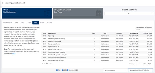
The Rank Tab lets you dig into the data, showing most and least charged offenses. It offers all sorts of filtering and search options, so you can really zero in on whatever you’re looking for. For example, want to know how many resisting arrest charges were filed in your county in any year? Type it in the search bar to pull up the data. Want to browse the most commonly charged non-DWI misdemeanor traffic offenses (the offenses that make up the bulk of the system)? Filter to that offense category and you’ll get this list:
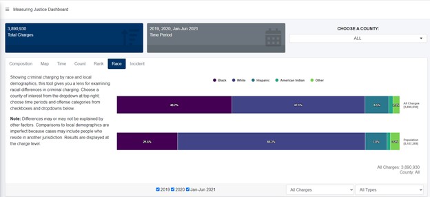
The Race tab gives you a lens for examining racial and ethnic differences in criminal charging. As with all other tabs, you can look at the issue at the state level or filter to a specific county. You also can tailor the time period and offense category. Here’s a visualization from that page, showing all charges—misdemeanor and felonies—statewide, across all Dashboard years.
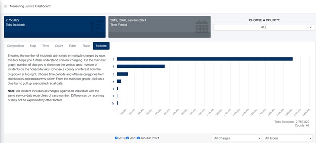
While the other tabs display data at the charge level, the Incident tab presents data at the incident level. On this tab, an incident includes all charges against an individual with the same service date regardless of case number. As you can see from the visualization below, the great bulk of incidents (just over two million) involve only one charge and a smaller but sizeable number involve two charges. Of course, you can look at this issue at the county level, and tailor time periods and offense categories.
From the main visualization on the Incident tab, clicking on any of the blue bars pulls up associated demographic data. For example, when I click on the bar showing the two million incidents with only one charge, I get this visualization:
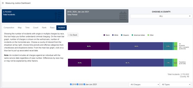
While the visualization on the Race tab is at the charge level, this one is at the incident level. It provides important additional information for understanding charging across demographic groups. For example, as you explore this tab online, you’ll see that at the state level, differences across demographic groups are larger for incidents with more than one charge.
Importantly, for all racial data we use the term “differences,” and we note that differences by race may or may not be explained by other factors.
We’ve designed the Dashboard to give you clear, accessible information to help you understand our state and local systems and spot areas of success and areas that might need attention. We’re working on new metrics and welcome your feedback on how we can refine and improve the Dashboard.