The UNC School of Government Criminal Justice Innovation Lab recently launched the first version of its new Measuring Justice Dashboard. Here’s some information about our new data visualization tool.
Why a Dashboard?
We get lots of requests from stakeholders about how the criminal justice system functions. Questions like: How often do officers use citations? How does our citation rate compare to our peer counties? What does criminal charging look like in our county? Is charging going up or down? What types of crimes are charged in our county? What’s our failure to appear rate? What percent of our cases end up being resolved by conviction? And so on. We developed the Measuring Justice Dashboard to begin to answer these questions.
What’s in the Dashboard?
Version 1 of the Dashboard includes metrics on citation versus arrest and summons versus warrant. For those first two metrics, you can look at data in a few different ways. First, there’s the Map view, providing an overview of practice statewide. For this and all other views, you can look at results at the state level or drill down on data for your county. You also can choose the relevant time period and type of cases that you’re interested to examine.
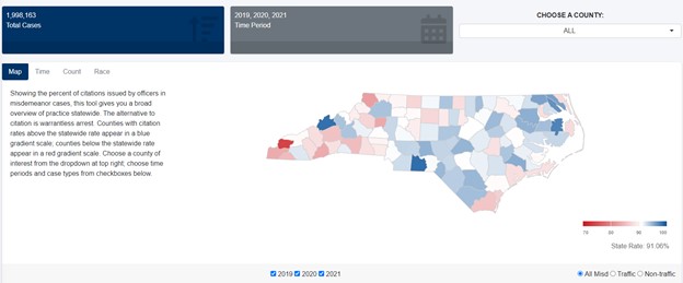
Figure 1: Map View—Citation rates at the state level 2019-2021
Time view lets you look at citation and summons rates over time. It allows you to see, for example, how these rates have changed in different time periods, such as pre-pandemic and during the pandemic.
Figure 2: Time View—Citation rates at the state level 2019-2021
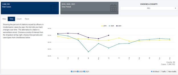
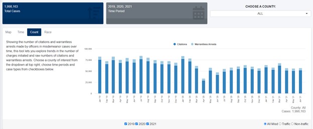
Count view switches the visualizations to raw numbers and is an important complement to the Time view. For example, as you can see from Figure 2 above, citation rates for misdemeanor offenses dropped in April 2020. Looking at the Count Tab (Figure 3 below) however helps explain this result: In April 2020 charging overall dropped significantly. And we know that in this period, for public health and other reasons associated with the COVID-19 pandemic, officers were limiting charging to more serious offenses, a practice that likely led to an increased rate of warrantless arrests and parallel decreased citation rate.
Figure 3: Count View—Citation and arrest counts at the state level 2019-2021
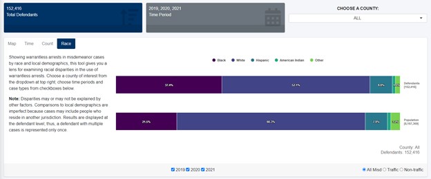
Finally, the Race view allows you examine arrest rates by race. As we clearly note on that page, disparities may or may not be explained by other factors. These other factors might include things like the nature of the offense in question and the person’s prior record. Notwithstanding that, this view gives you a tool to better understand how the criminal system impacts different populations.
Figure 4: Race View—Warrantless arrests at the state level 2019-2021
Where does the Dashboard data come from?
To build these first two metrics we used data from the North Carolina Automated Criminal/Infraction System (ACIS). Racial data comes from census data for the adult population. We included a methodology section in the Dashboard detailing our analyses.
What’s next for the Dashboard?
We’re working on more metrics. Next up will be criminal charging data. Specifically, you will be able to see proportions of felony versus misdemeanor charging and violent and non-violent charging. You also will be able to look at charging rates and counts over time. Racial data will be provided as will a table allowing you to take a deep dive into specific offenses charged at the state level and in your county. For example, you will be able to see charging counts for the most and least commonly charged offenses, in a variety of categories (e.g., violent felonies, non-violent felonies). After that we’ll move on to other metrics, including FTA rates, conviction rates, and more. We’re also working on enhanced features for existing metrics such as visualizations showing counts of defendants with multiple arrests. If you have thoughts about something else that we should add to the Dashboard, please get in touch via email.